

Organization
ForeFlight (A Boeing Company)
Team
HCDE Project Team
My Role
UX Research and Design
Timeline
3 months (Jan–Mar 2025)
Overview
ForeFlight is a market-leading aviation platform used by pilots to plan and execute flights in time-sensitive environments. However, in-app support resources were fragmented and difficult to access within critical workflows, increasing cognitive load during flight planning.
What I did
I designed the study plan, led usability sessions with pilots, and translated research insights into structured design recommendations, resulting in a more accessible and context-aware support experience embedded within pilots’ primary workflows.
Impact
8 High-severity friction points
Uncovered critical breakdowns in support discoverability across 4 moderated usability sessions with pilots.
6 Prioritized design recommendations
Translated research findings into prioritized, implementation-ready solutions.
Final Design Snapshot
Always-visible Help Entry Point
Help is surfaced directly within core workflows, making support easier to access during time-sensitive tasks.
Structured Support with Search + Browse
Pilots can quickly search with categories to get right support content without relying on trial and error.
The Problem
Although ForeFlight provides multiple support resources, help is distributed across different locations, making it unclear where to find the right solution.
Reframing the Problem
We initially assumed the issue was the quality of the support resources themselves. As we looked closer at how pilots sought help, we found that the core issue was discoverability.
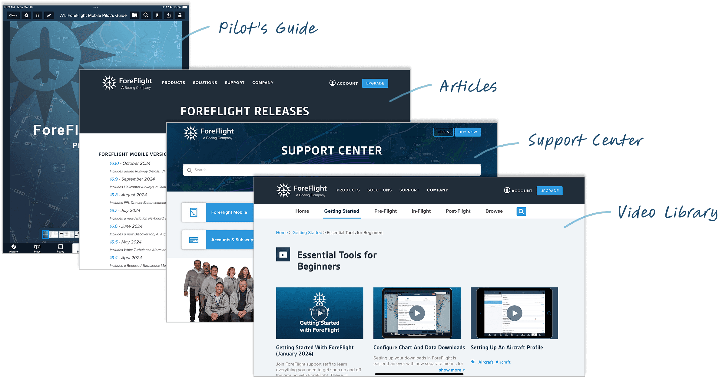
Mapping Where Support Lives
To understand why discoverability broke down, we mapped how support resources were distributed. We found that: Support existed across many surfaces, but there was no clear way to tell where to start or which resource would help in a given situation.

Designing Within Constraints
Working with ForeFlight, the project is under several constraints:
Aviation domain expertise
Support content had to remain technically accurate and aligned with professional aviation standards.
Limited timeline
The project ran for 10 weeks, requiring a tightly scoped and focused solution.
Tablet platform focus
Over 80% of ForeFlight users rely on tablets, so the design focused on the tablet experience.
Within these constraints, we defined an MVP focused on improving the visibility, entry points, and effectiveness of existing support resources.
Key Research Insights
We conducted usability testing with 4 pilots across experience levels, including student pilots, flight school trainees, and general aviation pilots.
Support was hard to notice when pilots needed help
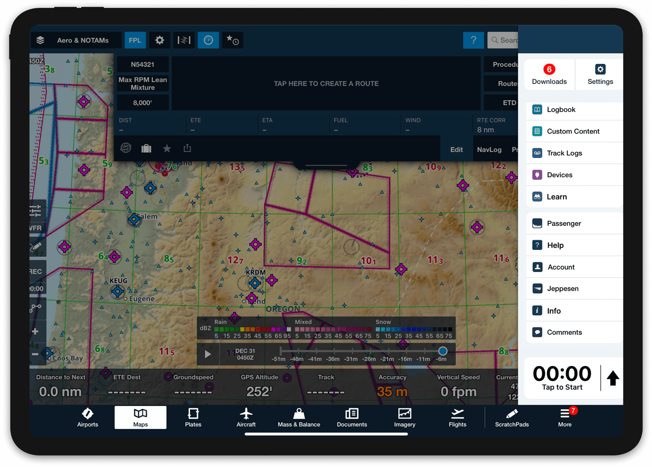
There’s always the Help menu item. That does not exist in the ForeFlight app, as far as I’ve seen it.
— Commercial Pilot

Search was the primary way pilots looked for help, but it often failed them
There’s no search for videos in the ForeFlight library, so it’s easier to just Google it.
— Airline Transport Pilot

Design Recommendation #1
Pilots often need help in the moment, but support was buried. I redesigned the entry points to make help visible across core workflows, reducing hesitation when pilots need answers quickly.

Before

Help entry points were hidden in secondary menus
Support discovery depended on prior knowledge of where help lived

After

Help is surfaced through a clear, always-visible “?” icon
“Support” is reframed as “Help” to better align with how pilots look for assistance
Design Recommendation #2
Pilots usually start by searching for help, but search results often felt overwhelming and unhelpful. I redesigned the support to combine search with a structured browsing experience.
Before
Learning-focused content was buried and hard to identify
Video categories and labels were unclear, making it difficult to know where to start

After
Pilots can either search directly or browse with a structured experience
Clear category labels support quick orientation and learning intent
Reflection
Working with constraints
Due to scheduling issues and last-minute drop-offs, we recruited 4 pilots instead of the 7 planned. This limited quantitative comparisons and pushed us to rely more on qualitative insights, reinforcing the importance of adapting research methods under real-world constraints.
If I had more time…
With additional time, we would recruit more pilots across experience levels and better understand how support resources are used over time, helping validate the long-term impact of our recommendations.


