Project Type
B2B, IT Consulting, Web Design
Team
1 UX Researcher/Designer, 2 Engineers, 1 Project Manager, 1 CEO
My Role
UX Research & Design Intern
Timeline
3 months (Jun–Sep 2025)
Overview
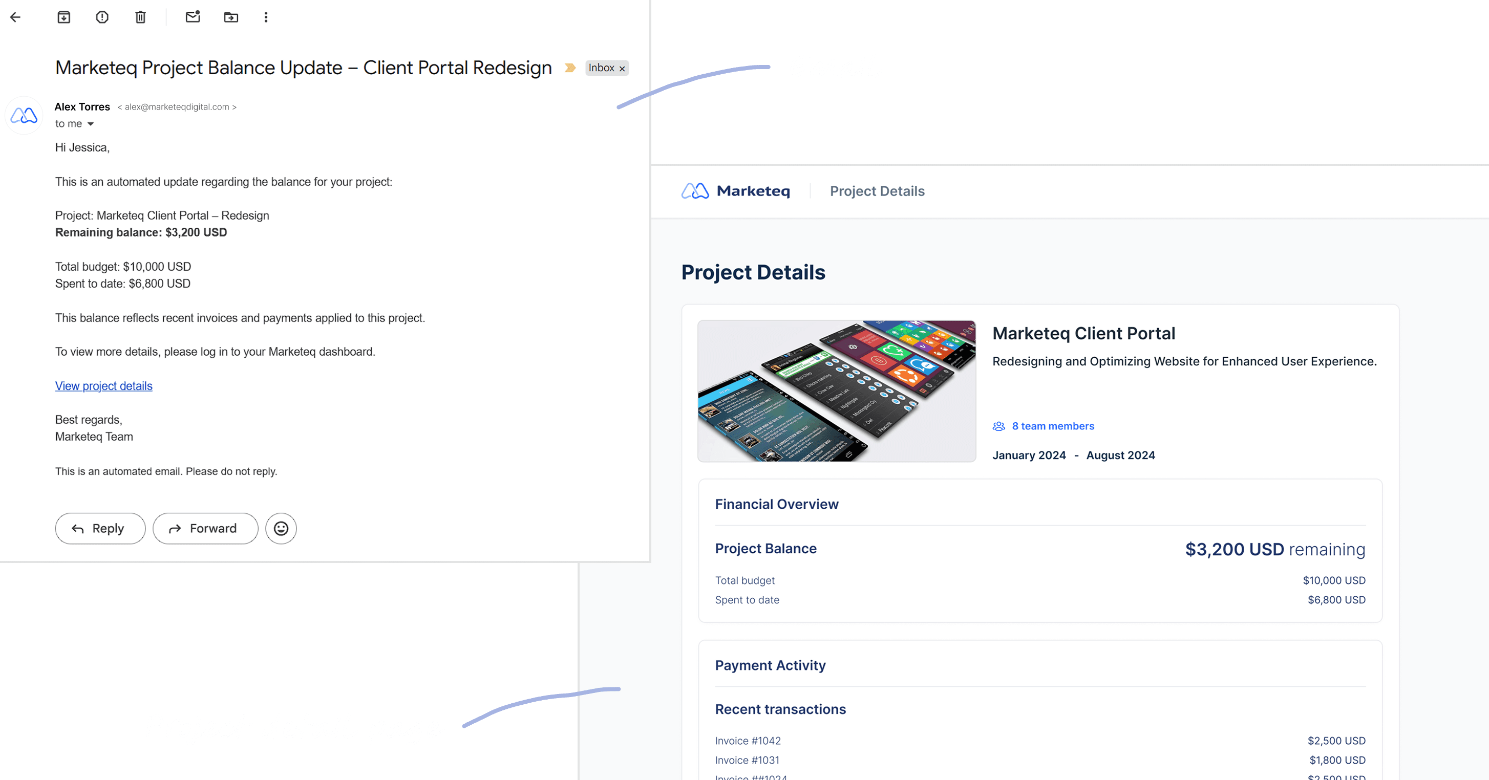
Marketeq Wallet is a new desktop web wallet feature designed for operations and finance managers at IT consulting firms. Returning clients often couldn’t tell whether they already had usable funds across projects and currencies, leading to duplicate payments and refund requests.
I led the end-to-end design of a 0→1 centralized wallet experience within the existing platform, surfacing available balances by currency and project to help users decide whether they need to pay again, while reducing payment errors and internal operational overhead.
Impact
45% Clearer balance visibility
Balances surfaced by project and currency removed the need for manual cross-checking.
62% Fewer duplicate payment attempts
Clients could verify usable funds before paying, preventing repeated transactions.
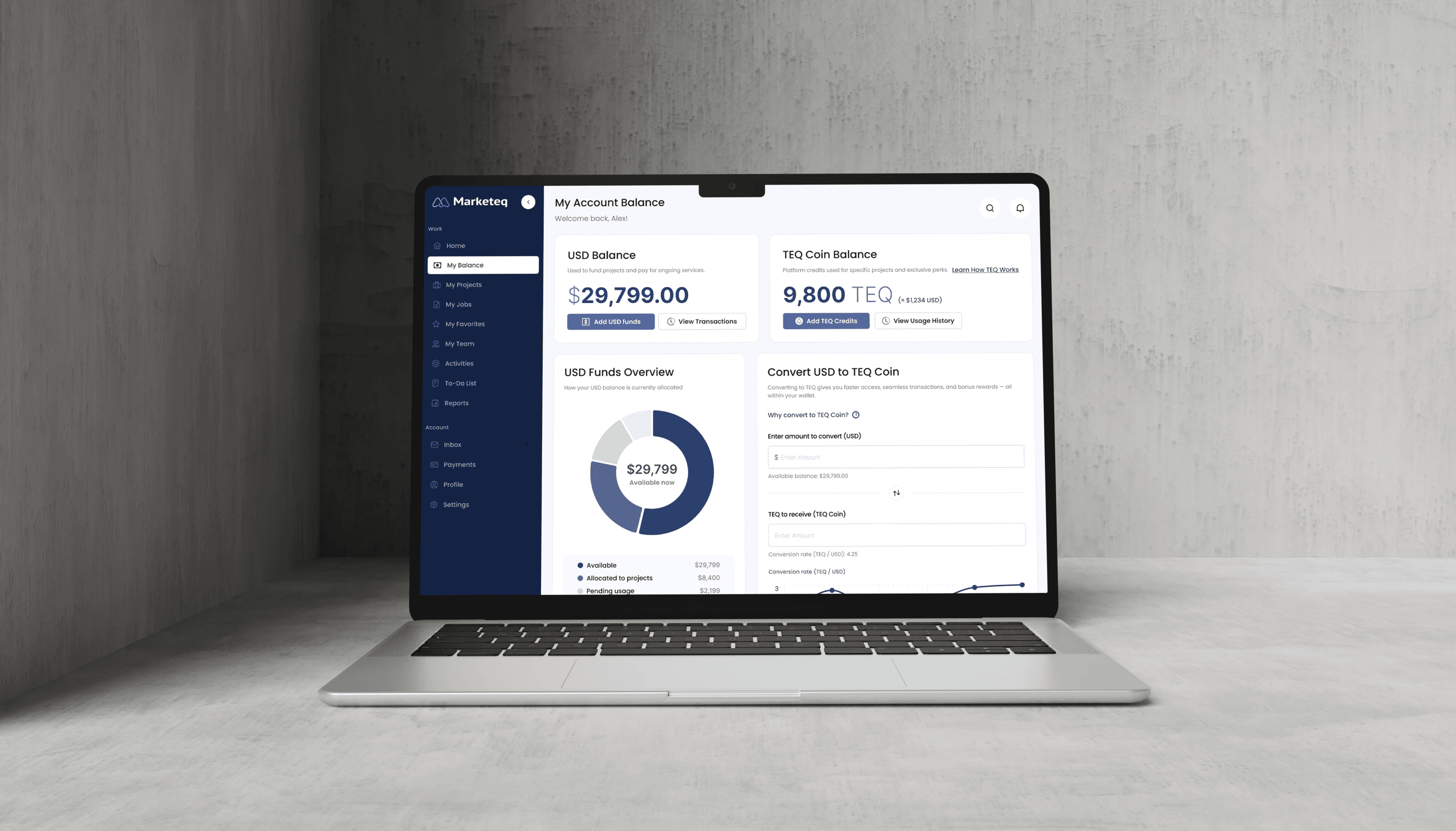
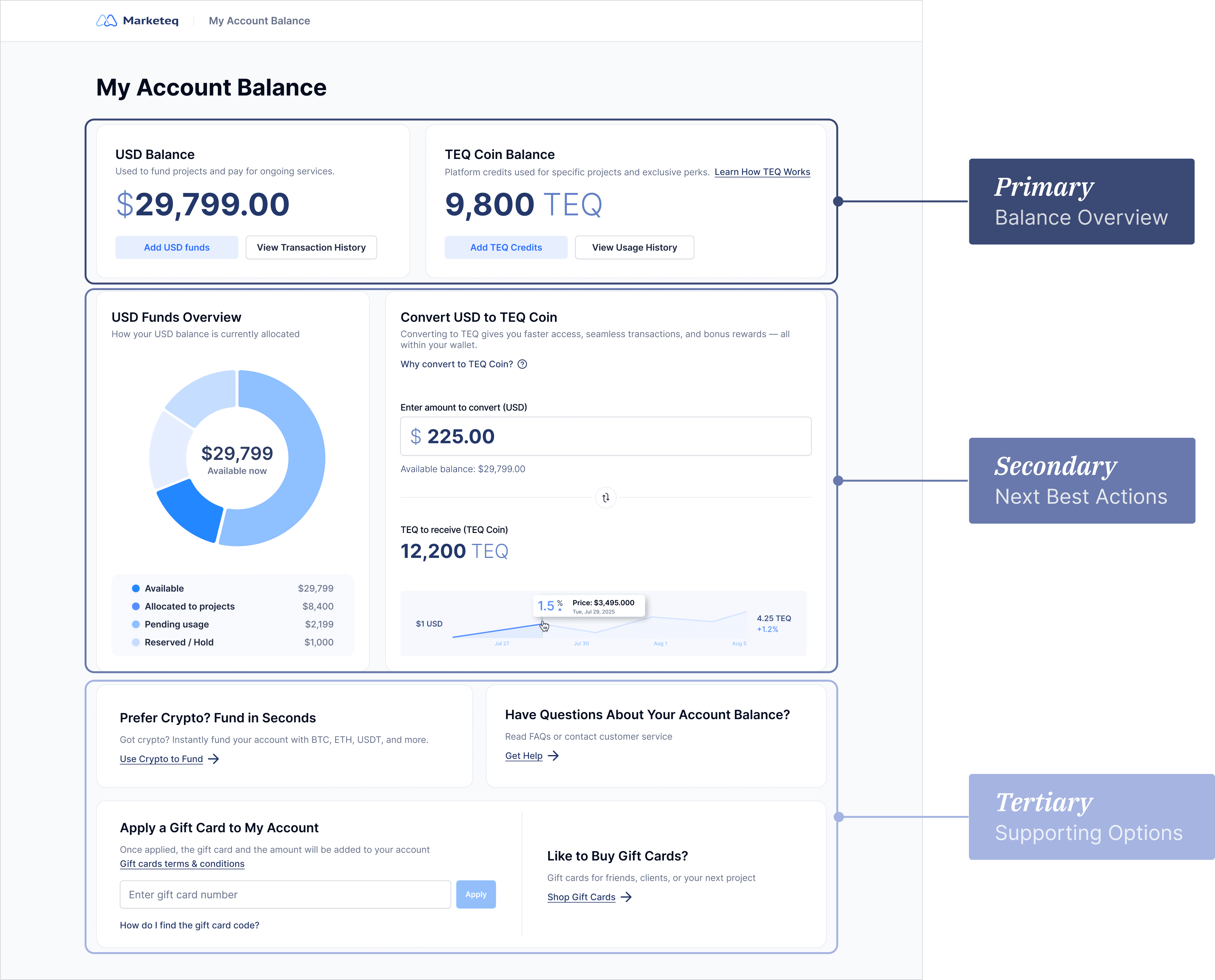
Final Design Snapshot
Transparent USD–TEQ conversion preview
Preview conversion rates and TEQ amounts before converting to support confident funding decisions.
Balance breakdown across project states
See how balances are distributed across project states to understand available funds at a glance.
Quick Context (for non-fintech readers)
Who are the users?
Operations and finance managers at IT consulting firms who manage project payments and budgets across multiple clients.
What is TEQ?
TEQ is an internal balance that clients can use to pay for services on the platform, similar to stored credit rather than a public currency.
Why dual-currency (USD + TEQ)?
Due to business and accounting constraints, payments are made in USD while value can be stored and reused as TEQ for future projects.
The Problem
Nearly 30% of returning clients returning to continue or expand existing projects chose to pay again instead of reusing previous payments. This led to repeated refund requests, extra reconciliation work, and increased support load for internal teams.
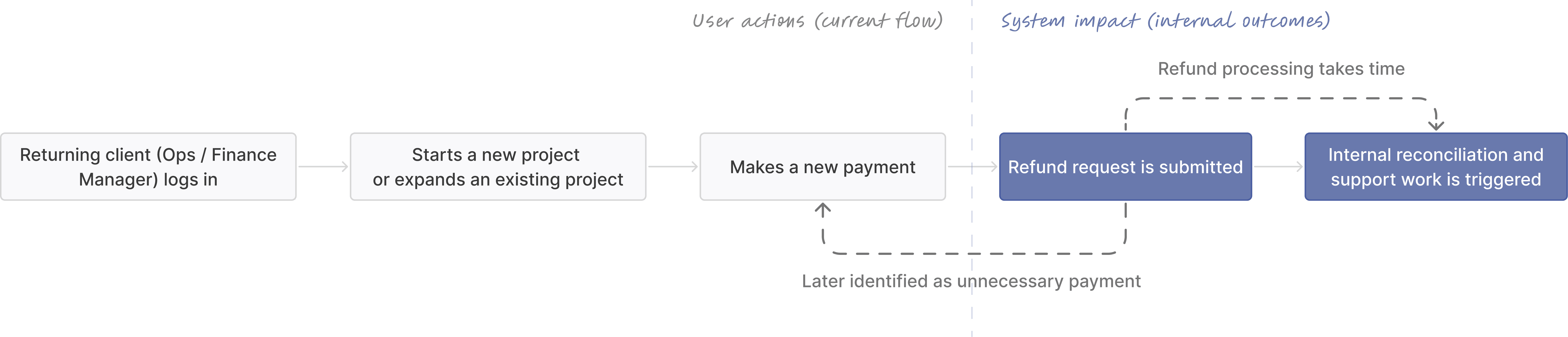
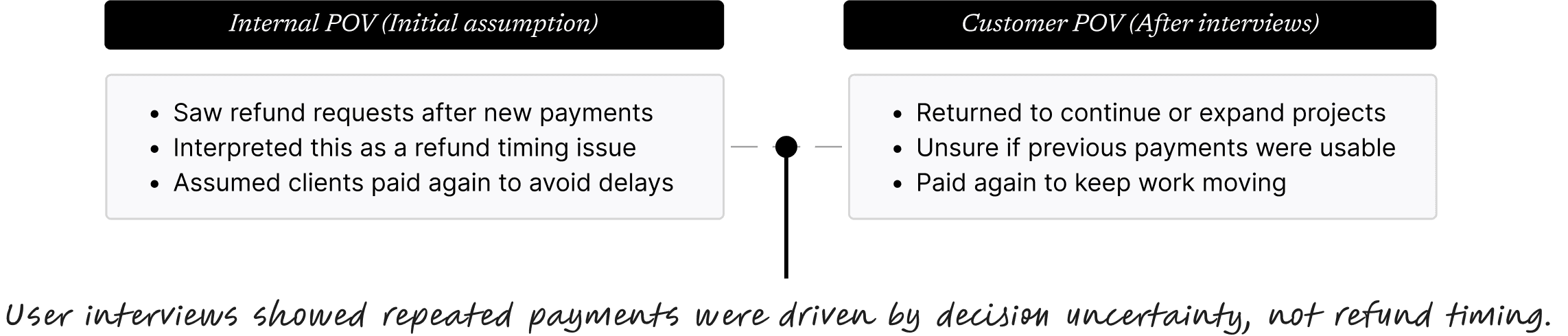
What We Initially Got Wrong
At first, we thought clients were paying again because of time delays, refunds took too long to process, so they chose to move forward and pay again.
However, after conducting user interviews, I realized the issue wasn’t timing. It was balance visibility. Unclear remaining funds from previous projects often led clients to pay again.
How I Changed the Strategy
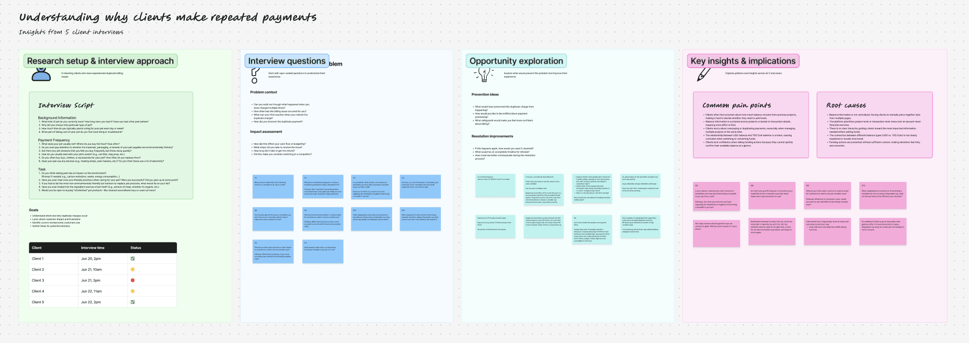
Through 5 remote semi-structured user interviews with returning clients (Ops / Finance managers), 4 internal workflow reviews, and analysis of 12+ competitor platforms, I validated what clients needed most. Based on these findings, I proposed to the CEO that we shift the strategy toward reducing duplicate payments by clarifying available balances.
Key Research Insights
Repeated payment setup slowed down returning clients
Every time we start a new project, I have to go through the same payment setup again.
— Returning client, Operations Manager
Clients lacked a clear way to understand remaining funds across projects
There’s no clear way to tell if we still have funds left.
— Returning client, Finance lead
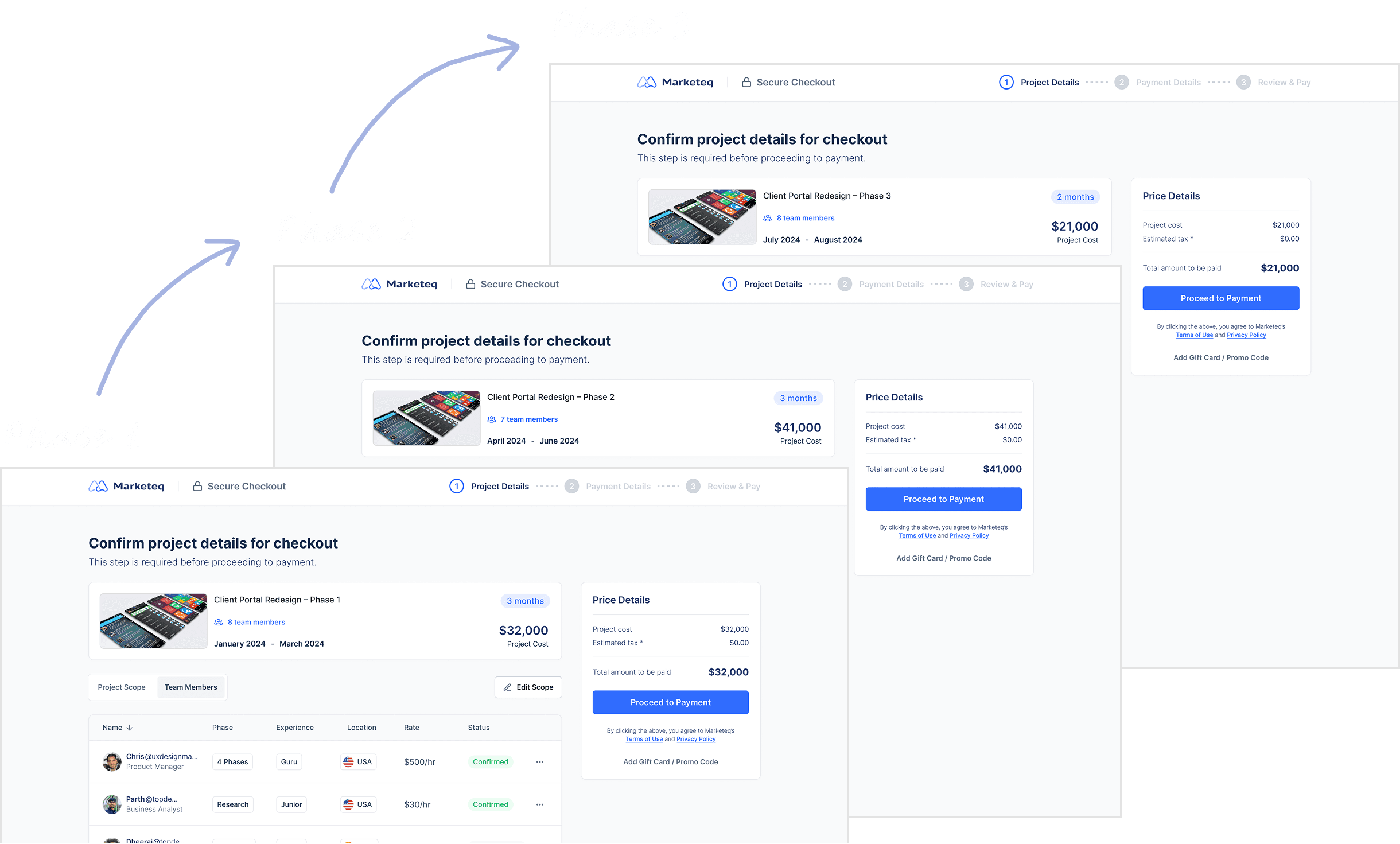
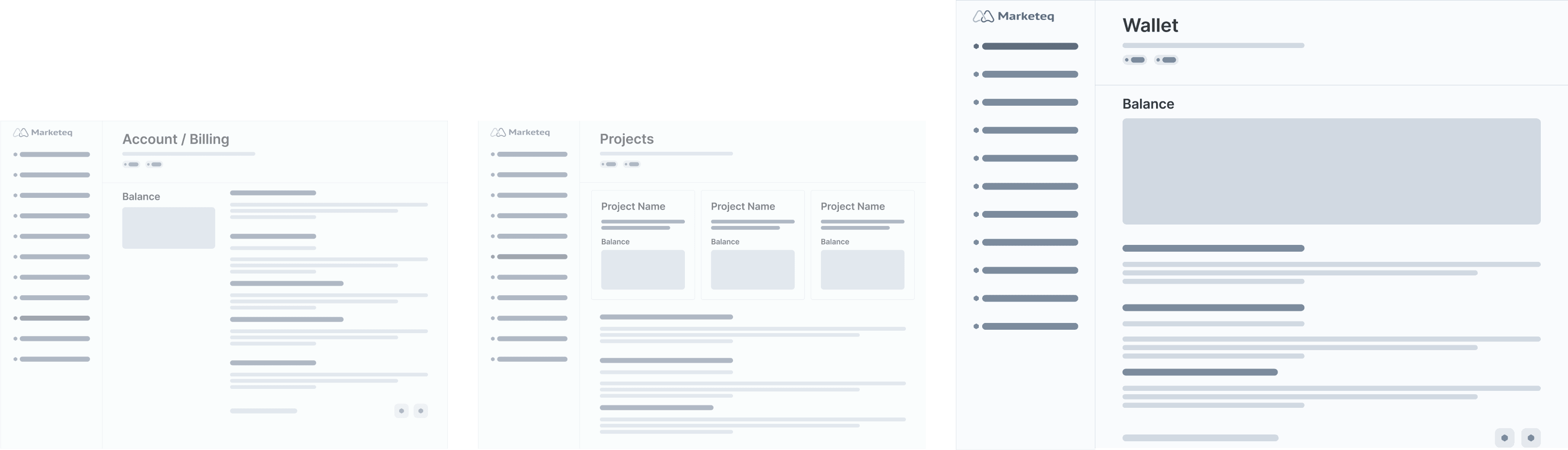
Design Exploration #1 - Wallet
I explored different places to surface balance information. Among the options, a wallet provided the clearest mental model for understanding remaining funds, while also creating a scalable structure for future balance and funding capabilities.
Why a wallet could improve balance clarity?
Before, users had to piece together their remaining balance from project details or wait until refunds were returned.
Balances are surfaced at the exact moment clients decide whether to pay again.
A centralized wallet also supports Marketeq’s long-term vision of allowing clients to store value as TEQ Coin for future use.
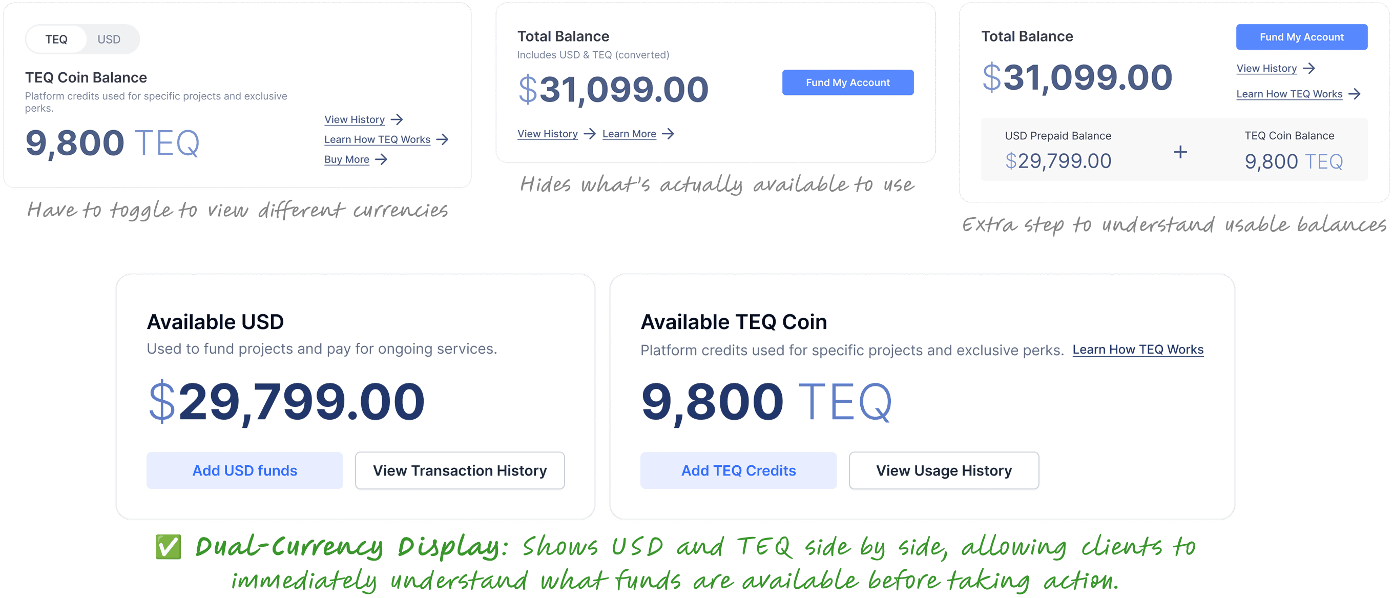
Design Exploration #2 - Balances Display
To surface balances across USD and TEQ, I explored different layouts focusing on the most relevant balances at the moment of decision.
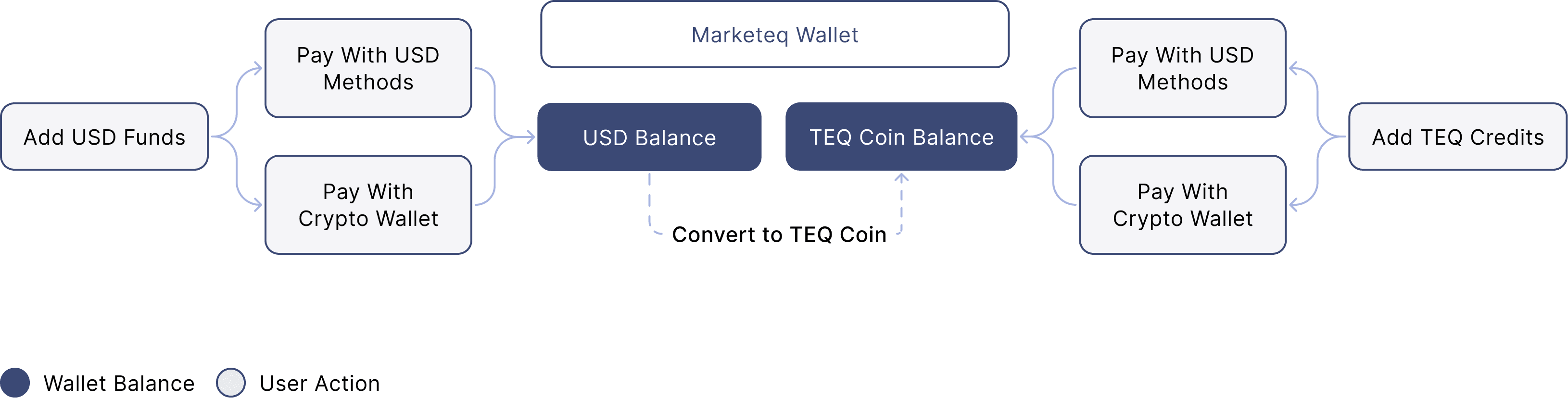
Design Exploration #3 - Wallet Structure & Dashboard
I mapped the relationships between funding methods, currencies, and balances to redesign the wallet structure around remaining funds.
Through 4 user testing sessions, I validated how clients prioritize balance information when deciding whether to add funds, which informed the primary, secondary, and tertiary structure of the wallet dashboard.
Final Solution

Balances were scattered across project pages, emails, and invoices
Clients couldn’t tell how much was still usable before checkout
Internal teams handled frequent refund requests and manual adjustments

Remaining balances are centralized and visible in one place
Clients see what’s available before deciding to pay again
Balance clarity reduces confusion across currencies and projects
Reflection
Clarity reduces 0→1 ambiguity
Designing a 0→1 product was initially uncomfortable because many assumptions were unproven. I learned that clarity doesn’t come from having all the answers, but from making assumptions explicit early, validating them quickly, and aligning cross-functional partners often. By grounding discussions in user behavior instead of opinions, I was able to move forward with confidence despite ambiguity.
If I had more time…
I would continue validating long-term impact by tracking post-launch metrics such as repeat payment rate, refund volume, and funding time for returning clients. I would also explore predictive prompts that proactively surface remaining balances before checkout to further reduce friction.


